Today marks the 232nd anniversary of the beginning of the Siege of Savannah, which lasted from September 16th to October 18th, 1779.
In honor of one of the bloodiest battles of the Revolutionary War, here is a 1779 map of Savannah, Georgia by Pierre Ozanne:
During the Siege of Savannah, troops led by French Admiral the Comte d'Estaing attempted to reclaim Savannah, Georgia from the British. D'Estaing had just recaptured Grenada from the British, and there were high hopes for his success in Savannah. Unfortunately, the tactics employed on the Franco-American side were perhaps not the wisest (bombarding the city rather than the entrenchments, putting off the assault on British defenses until there were not enough supplies to last through a traditional siege), and the British won a decisive victory. They held Savannah until July 1782, near the end of the war.
For a detailed and zoom-able version of the map, click here.
To read more about the Siege of Savannah, click here.
Friday, September 16, 2011
Monday, August 22, 2011
Pop vs. Soda
The eternal debate-- when it comes time to ask which flavors of carbonated beverage a restaurant or friend has on hand, do you ask what kind of pop they have, or do you ask if they have soda? Or perhaps you prefer to call it all coke?
Unsurprisingly, your word preference has a lot to do with your geographical location, as is shown with this map:
Personally, I call it 'pop,' and have been given much grief by a friend in Virginia about it for years. But my Michiganian (sorry, don't like the word Michigander. Makes me think of geese) pride forbids me from calling it anything else.
Unsurprisingly, your word preference has a lot to do with your geographical location, as is shown with this map:
Personally, I call it 'pop,' and have been given much grief by a friend in Virginia about it for years. But my Michiganian (sorry, don't like the word Michigander. Makes me think of geese) pride forbids me from calling it anything else.
Monday, August 15, 2011
The Heartland: States United
This wonderful artwork, which was created by Beauchamping and sold on Etsy, depicts the United States arranged painstakingly so that, together, they form a big heart.
I'm amazed at how well it worked out, especially since the states were all drawn to the same scale and there was no skimping on the details of their borders.
Read more about it here. The original Etsy page can be found here.
I'm amazed at how well it worked out, especially since the states were all drawn to the same scale and there was no skimping on the details of their borders.
Read more about it here. The original Etsy page can be found here.
Monday, August 08, 2011
McDistance
Stephen von Worly got to thinking about the proliferation on McDonald's restaurants, and especially how they relate to society as a whole-- oftentimes, you can find these fast food joints (and others like them) along major highways for the convenience of those traveling long distances. He decided to make a map of the contiguous United States, colored by distance to the nearest McDonald’s:
Obviously the number of these restaurants corresponds with the population in any given area, which explains the spot in South Dakota that is furthest from any McDonald's-- someone there would have to travel about 145 miles to get some fare from the Golden Arches.
Read more about it on Mr. von Worly's site here.
Obviously the number of these restaurants corresponds with the population in any given area, which explains the spot in South Dakota that is furthest from any McDonald's-- someone there would have to travel about 145 miles to get some fare from the Golden Arches.
Read more about it on Mr. von Worly's site here.
Monday, August 01, 2011
The music of geography
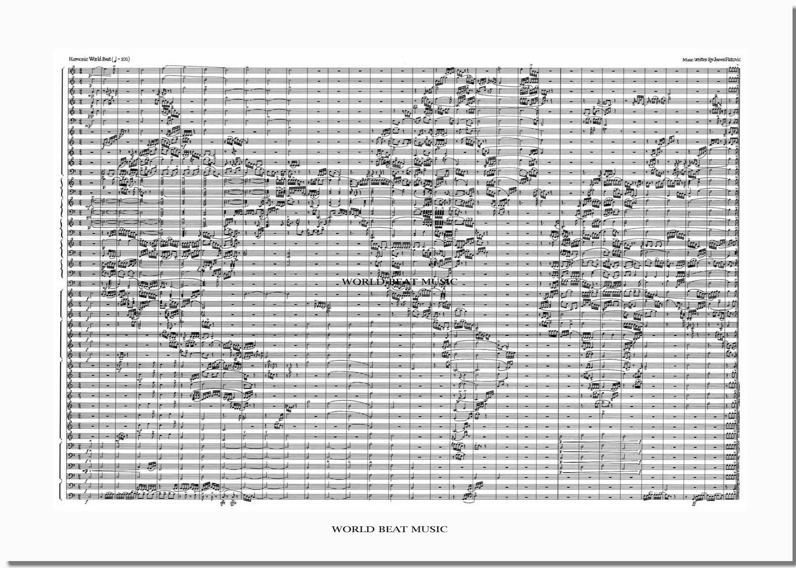
There are some people who feel that music is their entire world-- others, like James Plakovic, choose to make the entire world into music.
All of the continents have been transformed into notes and the oceans are rests in this interesting take on geography, titled "World Beat Music."
The piece is written for 37 instruments, each reading its line across the map from West to East, which leads to some very busy-sounding sections.
You can read more about the World Beat Music, and listen to an interview with Plakovic (and the music being played!) here.
(The player should jump directly to the desired segment, but if not, the times are 36:20-41:25.)
All of the continents have been transformed into notes and the oceans are rests in this interesting take on geography, titled "World Beat Music."
The piece is written for 37 instruments, each reading its line across the map from West to East, which leads to some very busy-sounding sections.
You can read more about the World Beat Music, and listen to an interview with Plakovic (and the music being played!) here.
(The player should jump directly to the desired segment, but if not, the times are 36:20-41:25.)
Monday, July 25, 2011
The Moon, in color
The United States Geological Survey teamed up with NASA from 1971 to 1998 to create a series of beautiful maps of the Moon and other planets. These maps are color-coded to show geological materials and phenomena, and the result is something that wouldn't look amiss hanging in an art gallery. Here's a portion of the map of the far (or 'dark,' if you prefer) side of the Moon:
And here is one of the Moon's western hemisphere:
You can check out the Wired article on these maps here.
And here is one of the Moon's western hemisphere:
You can check out the Wired article on these maps here.
Wednesday, July 20, 2011
People movin'
Carlo Zapponi has created a wonderful visualization of the world's migration patterns as of 2010 using HTML5 technology. The project, called PeopleMovin and found at http://peoplemov.in, has lots of information about migration in general as well as the country-specific numbers. For instance, about 3.15% of the world's population lives outside of their countries, and the United States is the most popular migrant destination. Refugees and asylum-seekers make up about 8% of all international migrants, and the majority of those (65%) come from North Africa and the Middle East.
This website is set up fairly intuitively, with two long columns stretching down the page, split into sections representing countries. If you click on a bar on the left-hand side, information will come up concerning the number of people who left the country and the country they went to. Here's the information for the United States:
The lines connect to the corresponding countries on the right-hand bar, and the thickness of the lines indicates the number of people who moved.
If you click on a bar on the right-hand side, you'll get information for all the people who moved into that particular country, and their countries of origin. Again, the thickness of the line indicates the number of people. Here's the United States:
It's really a beautiful interface, and it's very easy to lose some time playing around with it.
This website is set up fairly intuitively, with two long columns stretching down the page, split into sections representing countries. If you click on a bar on the left-hand side, information will come up concerning the number of people who left the country and the country they went to. Here's the information for the United States:
The lines connect to the corresponding countries on the right-hand bar, and the thickness of the lines indicates the number of people who moved.
If you click on a bar on the right-hand side, you'll get information for all the people who moved into that particular country, and their countries of origin. Again, the thickness of the line indicates the number of people. Here's the United States:
It's really a beautiful interface, and it's very easy to lose some time playing around with it.
Subscribe to:
Posts (Atom)