After careful deliberation, it has been decided that one blog will be sufficient for the Clark Library. I have had a lot of fun with Cartographic Curiosities, and hope that you have, too.
Please remember to check out http://clark-library.blogspot.com/ for more interesting maps, as well as visualizations and news from the Clark Library!
The blog is dead! Long live the blog!
Wednesday, April 11, 2012


Tuesday, April 03, 2012
Google Maps Quest
In case you missed it, Google Maps had a lovely April Fools Day feature called Quest, which gave their maps quite a makeover. Here's Michigan:

As someone with a healthy dose of nostalgia for early RPGs, I absolutely loved the new art, as well as the 'commercial' that Google made.
Here's Ann Arbor:

Those two figures in the rainbow beanies watching beatifically over the city are the symbol that Google put to represent their Ann Arbor office.
The StreetView feature also got quite a bit more pixellated, as can be seen in this screenshot of the Michigan Theater on Liberty:

The StreetView character was decked out in armor, as every good adventurer should be (safety first!):
 There are also plenty of Easter eggs hidden around the world, like this one of Area 51:

Check out more cool Easter Eggs here, and explore the 8-bit glory of the map for yourself here (it's no longer available on the Google Maps main page).

As someone with a healthy dose of nostalgia for early RPGs, I absolutely loved the new art, as well as the 'commercial' that Google made.
Here's Ann Arbor:

Those two figures in the rainbow beanies watching beatifically over the city are the symbol that Google put to represent their Ann Arbor office.
The StreetView feature also got quite a bit more pixellated, as can be seen in this screenshot of the Michigan Theater on Liberty:

The StreetView character was decked out in armor, as every good adventurer should be (safety first!):


Check out more cool Easter Eggs here, and explore the 8-bit glory of the map for yourself here (it's no longer available on the Google Maps main page).
Wednesday, March 21, 2012
Real-Time Internet Visualizations
Have you ever been frustrated by your internet speed, or worried about attack traffic on the internet? Well, thanks to Akamai, owners of a cloud platform that all of us have likely used at one point or another unknowingly, you can see real-time maps of network attacks, internet latency, and network traffic.
Here's what the attack map looked like just moments ago, with a zoom-in on the continental United States:

As you can see, the overall number of attacks is about 15% higher than usual. California has suffered the most attacks in the past 24 hours, with 32. Not surprising, due to its high population.
To make this map, Akamai collects data on the number of connections that are attempted, the source IP address, the destination IP address, and the source and destination ports. The packets captured, they say, are generally from automated scanning trojans and worms looking to infect new computers scanning randomly generated IP addresses.
These maps are updated in real time, so check them out here however frequently you'd like.
Here's what the attack map looked like just moments ago, with a zoom-in on the continental United States:

As you can see, the overall number of attacks is about 15% higher than usual. California has suffered the most attacks in the past 24 hours, with 32. Not surprising, due to its high population.
To make this map, Akamai collects data on the number of connections that are attempted, the source IP address, the destination IP address, and the source and destination ports. The packets captured, they say, are generally from automated scanning trojans and worms looking to infect new computers scanning randomly generated IP addresses.
These maps are updated in real time, so check them out here however frequently you'd like.
Tuesday, March 06, 2012
Rorschmap
Looking for a map-related, kaleidoscope-related, or map-and-kaleidoscope-related website to help you while away the hours? Look no further than Rorschmap!
James Bridle created Rorschmap to explore what happens to maps once they leave the static medium of paper and become digital entities. It's really disorienting at first, but quite hypnotic and entertaining.
Here's a screencap of our very own Ann Arbor, Rorschmapified!

Beautiful, isn't it?
Read more about Rorschmap here.
James Bridle created Rorschmap to explore what happens to maps once they leave the static medium of paper and become digital entities. It's really disorienting at first, but quite hypnotic and entertaining.
Here's a screencap of our very own Ann Arbor, Rorschmapified!

Beautiful, isn't it?
Read more about Rorschmap here.
Wednesday, February 29, 2012
Geothermal energy potential in the U.S.
Over the span of three years, Google's philanthropic arm, Google.org, supported a project run by the SMU Geothermal Institute intended to map out the potential for geothermal energy use in the United States. Below is the result of their research.
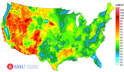
This map incorporates tens of thousands of new data points measuring the potential of Enhanced Geothermal Systems, and is the most comprehensive map of such data to date. There is a wealth of untapped geothermal energy in the nation's ground, just waiting to power our houses!
Read more about the results of the study (and Enhanced Geothermal Systems) here, and see some 3D models of Enhanced Geothermal Systems here.

This map incorporates tens of thousands of new data points measuring the potential of Enhanced Geothermal Systems, and is the most comprehensive map of such data to date. There is a wealth of untapped geothermal energy in the nation's ground, just waiting to power our houses!
Read more about the results of the study (and Enhanced Geothermal Systems) here, and see some 3D models of Enhanced Geothermal Systems here.
Wednesday, February 22, 2012
Art from maps
We all know and love art on maps, from monsters lounging in the sea to vignettes showing Roman gods and goddesses. But most of that art seems to exist on older maps, saved from a different time. Where is the art in maps today?
Matthew Cusick thought that maps today had their own kind of beauty, though they are often not illustrated like older maps are, and decided to turn the maps themselves into collages.
Here's a close-up of one of his collages:
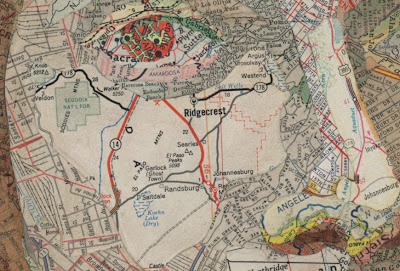
Part of me admires his handiwork and the beauty of his final product; part of me mourns the cutting up of maps to make the art. Since maps started being mass-produced, I suppose it's not as much of a deal... And I guess you can't make a map omelet without breaking a few map eggs, right?
See more of Mr. Cusick's map art here.
Matthew Cusick thought that maps today had their own kind of beauty, though they are often not illustrated like older maps are, and decided to turn the maps themselves into collages.
Here's a close-up of one of his collages:

Part of me admires his handiwork and the beauty of his final product; part of me mourns the cutting up of maps to make the art. Since maps started being mass-produced, I suppose it's not as much of a deal... And I guess you can't make a map omelet without breaking a few map eggs, right?
See more of Mr. Cusick's map art here.
Sunday, January 15, 2012
New blog!
The Map Library here at the University of Michigan has fused with Government Documents and the Spacial and Numeric Data Labs to reveal their ultimate final form: the Stephen S. Clark Library.
We're excited about the new blog, all integrated and shiny! Please follow along!
Of course, we will still try to whet your appetite for pure map-related goodness here, but the Clark Library blog will have all sorts of data visualizations and the like that you might also find interesting.
http://clark-library.blogspot.com/
We're excited about the new blog, all integrated and shiny! Please follow along!
Of course, we will still try to whet your appetite for pure map-related goodness here, but the Clark Library blog will have all sorts of data visualizations and the like that you might also find interesting.
http://clark-library.blogspot.com/
Tuesday, January 10, 2012
The salinity of Earth's oceans
In June of 2011, NASA launched a satellite named Aquarius, designed to monitor changes in the saltiness of the Earth's waters, rainfall and evaporation of Earth's waters, and climate and weather variations. Aquarius became operational in late August of 2011, and here is a map from its first two and a half weeks of data:

The red areas of the map have the highest surface salinity, and the purple areas the lowest.
By tracking changes in the salinity of the oceans, scientists will be better able to understand ocean currents and the movement of fresh water. For instance, the satellite captured images of the effects of tropical storm Lee as it hit Louisiana, causing the Mississippi River to discharge much more than it usually does, which led to a corresponding area of lowered salinity, pictured below.

You can see the current location of the satellite here: http://aquarius.gsfc.nasa.gov/cgi/whereis_aquarius
To read more about the first map, go here: http://www.nasa.gov/mission_pages/aquarius/multimedia/gallery/pia14786.html
For more information about the Aquarius project, visit http://aquarius.nasa.gov/

The red areas of the map have the highest surface salinity, and the purple areas the lowest.
By tracking changes in the salinity of the oceans, scientists will be better able to understand ocean currents and the movement of fresh water. For instance, the satellite captured images of the effects of tropical storm Lee as it hit Louisiana, causing the Mississippi River to discharge much more than it usually does, which led to a corresponding area of lowered salinity, pictured below.

The salinity of the area was only temporarily lowered, as can be seen in the middle image above. Read more about the data from this time period here: http://photojournal.jpl.nasa.gov/catalog/pia15185
You can see the current location of the satellite here: http://aquarius.gsfc.nasa.gov/cgi/whereis_aquarius
To read more about the first map, go here: http://www.nasa.gov/mission_pages/aquarius/multimedia/gallery/pia14786.html
For more information about the Aquarius project, visit http://aquarius.nasa.gov/
Wednesday, November 23, 2011
Happy Thanksgiving!
Tomorrow is the always great Turkey Day, a wonderful time for getting together with family and loved ones, counting your blessings, and eating until you pass out.
What's that? You don't have a recipe for the potluck picked out?
Well, luckily, in 2009 the New York Times compiled what people were searching for the day before Thanksgiving using AllRecipes.com, and made a series of maps showing where those recipes were most frequently searched. That should be a lovely place to get some inspiration and choose something to make for your family. By far, the most popular search was for "sweet potato casserole"-- and with good cause. Those things are delicious!

It's interesting to see which search terms were extremely localized, such as "corn pudding" or "broccoli casserole" (visible to the left of the main map in the image below):
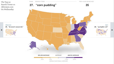
Hopefully flipping through those maps should give you some ideas, or at least a little entertainment.
Happy Thanksgiving, everyone!
What's that? You don't have a recipe for the potluck picked out?
Well, luckily, in 2009 the New York Times compiled what people were searching for the day before Thanksgiving using AllRecipes.com, and made a series of maps showing where those recipes were most frequently searched. That should be a lovely place to get some inspiration and choose something to make for your family. By far, the most popular search was for "sweet potato casserole"-- and with good cause. Those things are delicious!

It's interesting to see which search terms were extremely localized, such as "corn pudding" or "broccoli casserole" (visible to the left of the main map in the image below):

Hopefully flipping through those maps should give you some ideas, or at least a little entertainment.
Happy Thanksgiving, everyone!
Tuesday, November 15, 2011
LocalHarvest.org
Have you been hearing about the economic and environmental benefits of buying local produce, but are unsure of how to go about looking for the resources necessary to find what you need? Look no further! LocalHarvest.org, founded in 1998, is a very helpful website that shows you farmers' markets, grocery stores, and many other places where you can get sustainably-grown produce, grass-fed meats, and lots of other interesting goods.

Here's a screenshot of the map on the front page zoomed in on Ann Arbor.
And there's no reason to think that produce will be unavailable during the winter months, either-- some of these places offer frozen or preserved foods as well as fresh.

Here's a screenshot of the map on the front page zoomed in on Ann Arbor.
And there's no reason to think that produce will be unavailable during the winter months, either-- some of these places offer frozen or preserved foods as well as fresh.
Monday, November 07, 2011
Common Census
The CommonCensus Map Project is an attempt to map the 'spheres of influence' present in the United States, as reported by people who visit the site. It's interesting to see how, in some cases, people feel more influenced by big cities in neighboring states than anything within their own state.

As you can see from the zoom-in feature, the two most influential cities in Michigan are listed as Detroit and Grand Rapids, and we lose a corner of the state to Chicago's influence.
The site is still collecting data, so feel free to go and add your voice!

As you can see from the zoom-in feature, the two most influential cities in Michigan are listed as Detroit and Grand Rapids, and we lose a corner of the state to Chicago's influence.
The site is still collecting data, so feel free to go and add your voice!
Friday, November 04, 2011
We're moving!
If you've been to the Map Library recently, you may have noticed that some changes are afoot. Later this month, we'll be moving to the second floor of the Hatcher Graduate Library to form part of the new Stephen S. Clark Library for Maps, Government Information and Spatial and Numeric Data Services. All of our wooden map cases were moved downstairs earlier this week, and more cases are moving today.
 |
| Moving cases out of the Map Library |
 |
| Clark Library entranceway and display cases |
 |
| The new reference desk |
 |
| West side of the library |
 |
| East side, facing the connector to the Shapiro Library |
We're planning to open to the public on Monday, November 14th. There will also be an official opening celebration on Friday, December 2nd at 4pm.
Sunday, October 30, 2011
Happy Halloween!
Ah, Halloween. That special time of year (and my personal favorite holiday) where people don costumes and eat far more candy than they should. An occasion for spending time with friends and frightening off the evil spirits, and carving jack-o'-lanterns to remind us of the souls trapped in Purgatory. Or just because it's a fun tradition.
In honor of Halloween tomorrow, here is a map created by Esri showing where the most money in America was spent on children's Halloween costumes last year.

Unsurprisingly, urban areas tend to spend more money, though sometimes they are outshone by the folk in suburban areas, which is shown by doughnut-like shapes of darker color-- for examples, look at the ones around Minneapolis, Minnesota, Indianapolis, Indiana, and Orlando, Floria.
I hope you all dress up and have a happy and safe Halloween!
Here is a larger version of the map.
In honor of Halloween tomorrow, here is a map created by Esri showing where the most money in America was spent on children's Halloween costumes last year.

Unsurprisingly, urban areas tend to spend more money, though sometimes they are outshone by the folk in suburban areas, which is shown by doughnut-like shapes of darker color-- for examples, look at the ones around Minneapolis, Minnesota, Indianapolis, Indiana, and Orlando, Floria.
I hope you all dress up and have a happy and safe Halloween!
Here is a larger version of the map.
Tuesday, October 25, 2011
Watersheds in Michigan
Watersheds, or drainage basins, are areas of land where all the water under it and all the water that drains off of it ends up in the same place. Oftentimes sediment, pollution, and fertilizer runoff can be deposited and concentrated in their watersheds, which is why it's important to remember to be cautious when dealing with substances that may end up in the groundwater.
The Hydrologic Studies Unit of the Land and Water Management Division in the Michigan Department of Environmental Quality made this helpful map to let people know which major watershed they were in.

Washtenaw County is mostly in the Huron watershed, but fairly large parts of it are also in the Raisin and Stony Creek watersheds.
See a larger and more complete version (including the U.P. and the legend) of the map here, and read more about watersheds here or here.
The Hydrologic Studies Unit of the Land and Water Management Division in the Michigan Department of Environmental Quality made this helpful map to let people know which major watershed they were in.

Washtenaw County is mostly in the Huron watershed, but fairly large parts of it are also in the Raisin and Stony Creek watersheds.
See a larger and more complete version (including the U.P. and the legend) of the map here, and read more about watersheds here or here.
Wednesday, October 19, 2011
Fall foliage maps
The Weather Channel has kindly provided an interactive map for those who want to know when the peak colors of fall will be gracing the branches of trees in their area.
Here we can see that, in early October, the Ann Arbor region (as well as most of the rest of the mitten) was still a little short of its peak:

Stay tuned, folks! The best is yet to come!
Here we can see that, in early October, the Ann Arbor region (as well as most of the rest of the mitten) was still a little short of its peak:

Stay tuned, folks! The best is yet to come!
Wednesday, October 12, 2011
Oil Spills by county
Since 1990, over 110 million gallons of crude oil and petroleum products have spilled from pipelines across America. The New York Times maps it all out by county here.

More than half of the spills occurred in Texas, Oklahoma, and Louisiana, where there are more pipelines and thus more potential for equipment failure and corrosion, two of the more prevalent causes for oil spills.

More than half of the spills occurred in Texas, Oklahoma, and Louisiana, where there are more pipelines and thus more potential for equipment failure and corrosion, two of the more prevalent causes for oil spills.
Friday, September 16, 2011
The Siege of Savannah
Today marks the 232nd anniversary of the beginning of the Siege of Savannah, which lasted from September 16th to October 18th, 1779.
In honor of one of the bloodiest battles of the Revolutionary War, here is a 1779 map of Savannah, Georgia by Pierre Ozanne:

During the Siege of Savannah, troops led by French Admiral the Comte d'Estaing attempted to reclaim Savannah, Georgia from the British. D'Estaing had just recaptured Grenada from the British, and there were high hopes for his success in Savannah. Unfortunately, the tactics employed on the Franco-American side were perhaps not the wisest (bombarding the city rather than the entrenchments, putting off the assault on British defenses until there were not enough supplies to last through a traditional siege), and the British won a decisive victory. They held Savannah until July 1782, near the end of the war.
For a detailed and zoom-able version of the map, click here.
To read more about the Siege of Savannah, click here.
In honor of one of the bloodiest battles of the Revolutionary War, here is a 1779 map of Savannah, Georgia by Pierre Ozanne:

During the Siege of Savannah, troops led by French Admiral the Comte d'Estaing attempted to reclaim Savannah, Georgia from the British. D'Estaing had just recaptured Grenada from the British, and there were high hopes for his success in Savannah. Unfortunately, the tactics employed on the Franco-American side were perhaps not the wisest (bombarding the city rather than the entrenchments, putting off the assault on British defenses until there were not enough supplies to last through a traditional siege), and the British won a decisive victory. They held Savannah until July 1782, near the end of the war.
For a detailed and zoom-able version of the map, click here.
To read more about the Siege of Savannah, click here.
Monday, August 22, 2011
Pop vs. Soda
The eternal debate-- when it comes time to ask which flavors of carbonated beverage a restaurant or friend has on hand, do you ask what kind of pop they have, or do you ask if they have soda? Or perhaps you prefer to call it all coke?
Unsurprisingly, your word preference has a lot to do with your geographical location, as is shown with this map:

Personally, I call it 'pop,' and have been given much grief by a friend in Virginia about it for years. But my Michiganian (sorry, don't like the word Michigander. Makes me think of geese) pride forbids me from calling it anything else.
Unsurprisingly, your word preference has a lot to do with your geographical location, as is shown with this map:

Personally, I call it 'pop,' and have been given much grief by a friend in Virginia about it for years. But my Michiganian (sorry, don't like the word Michigander. Makes me think of geese) pride forbids me from calling it anything else.
Monday, August 15, 2011
The Heartland: States United
This wonderful artwork, which was created by Beauchamping and sold on Etsy, depicts the United States arranged painstakingly so that, together, they form a big heart.
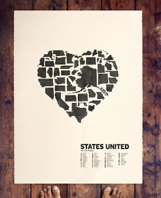
I'm amazed at how well it worked out, especially since the states were all drawn to the same scale and there was no skimping on the details of their borders.
Read more about it here. The original Etsy page can be found here.

I'm amazed at how well it worked out, especially since the states were all drawn to the same scale and there was no skimping on the details of their borders.
Read more about it here. The original Etsy page can be found here.
Monday, August 08, 2011
McDistance
Stephen von Worly got to thinking about the proliferation on McDonald's restaurants, and especially how they relate to society as a whole-- oftentimes, you can find these fast food joints (and others like them) along major highways for the convenience of those traveling long distances. He decided to make a map of the contiguous United States, colored by distance to the nearest McDonald’s:
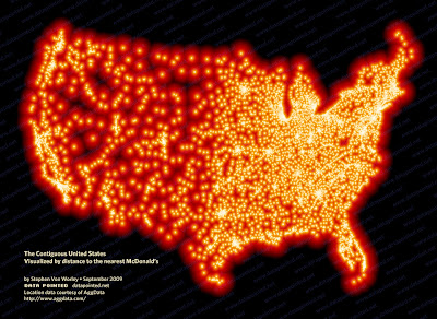
Obviously the number of these restaurants corresponds with the population in any given area, which explains the spot in South Dakota that is furthest from any McDonald's-- someone there would have to travel about 145 miles to get some fare from the Golden Arches.
Read more about it on Mr. von Worly's site here.

Obviously the number of these restaurants corresponds with the population in any given area, which explains the spot in South Dakota that is furthest from any McDonald's-- someone there would have to travel about 145 miles to get some fare from the Golden Arches.
Read more about it on Mr. von Worly's site here.
Subscribe to:
Posts (Atom)