Showing posts with label interactive. Show all posts

Tuesday, April 03, 2012

Google Maps Quest

In case you missed it, Google Maps had a lovely April Fools Day feature called Quest, which gave their maps quite a makeover. Here's Michigan:


As someone with a healthy dose of nostalgia for early RPGs, I absolutely loved the new art, as well as the 'commercial' that Google made.

Here's Ann Arbor:


Those two figures in the rainbow beanies watching beatifically over the city are the symbol that Google put to represent their Ann Arbor office.

The StreetView feature also got quite a bit more pixellated, as can be seen in this screenshot of the Michigan Theater on Liberty:


The StreetView character was decked out in armor, as every good adventurer should be (safety first!):


There are also plenty of Easter eggs hidden around the world, like this one of Area 51:


Check out more cool Easter Eggs here, and explore the 8-bit glory of the map for yourself here (it's no longer available on the Google Maps main page).

Wednesday, March 21, 2012

Real-Time Internet Visualizations

Have you ever been frustrated by your internet speed, or worried about attack traffic on the internet? Well, thanks to Akamai, owners of a cloud platform that all of us have likely used at one point or another unknowingly, you can see real-time maps of network attacks, internet latency, and network traffic.

Here's what the attack map looked like just moments ago, with a zoom-in on the continental United States:


As you can see, the overall number of attacks is about 15% higher than usual. California has suffered the most attacks in the past 24 hours, with 32. Not surprising, due to its high population.

To make this map, Akamai collects data on the number of connections that are attempted, the source IP address, the destination IP address, and the source and destination ports. The packets captured, they say, are generally from automated scanning trojans and worms looking to infect new computers scanning randomly generated IP addresses.

These maps are updated in real time, so check them out here however frequently you'd like.

Tuesday, March 06, 2012

Rorschmap

Looking for a map-related, kaleidoscope-related, or map-and-kaleidoscope-related website to help you while away the hours? Look no further than Rorschmap!

James Bridle created Rorschmap to explore what happens to maps once they leave the static medium of paper and become digital entities. It's really disorienting at first, but quite hypnotic and entertaining.

Here's a screencap of our very own Ann Arbor, Rorschmapified!


Beautiful, isn't it?

Read more about Rorschmap here.

Monday, November 07, 2011

Common Census

The CommonCensus Map Project is an attempt to map the 'spheres of influence' present in the United States, as reported by people who visit the site. It's interesting to see how, in some cases, people feel more influenced by big cities in neighboring states than anything within their own state.


As you can see from the zoom-in feature, the two most influential cities in Michigan are listed as Detroit and Grand Rapids, and we lose a corner of the state to Chicago's influence.

The site is still collecting data, so feel free to go and add your voice!

Wednesday, October 19, 2011

Fall foliage maps

The Weather Channel has kindly provided an interactive map for those who want to know when the peak colors of fall will be gracing the branches of trees in their area.

Here we can see that, in early October, the Ann Arbor region (as well as most of the rest of the mitten) was still a little short of its peak:


Stay tuned, folks! The best is yet to come!

Wednesday, July 20, 2011

People movin'

Carlo Zapponi has created a wonderful visualization of the world's migration patterns as of 2010 using HTML5 technology. The project, called PeopleMovin and found at http://peoplemov.in, has lots of information about migration in general as well as the country-specific numbers. For instance, about 3.15% of the world's population lives outside of their countries, and the United States is the most popular migrant destination. Refugees and asylum-seekers make up about 8% of all international migrants, and the majority of those (65%) come from North Africa and the Middle East.

This website is set up fairly intuitively, with two long columns stretching down the page, split into sections representing countries. If you click on a bar on the left-hand side, information will come up concerning the number of people who left the country and the country they went to. Here's the information for the United States:


The lines connect to the corresponding countries on the right-hand bar, and the thickness of the lines indicates the number of people who moved.

If you click on a bar on the right-hand side, you'll get information for all the people who moved into that particular country, and their countries of origin. Again, the thickness of the line indicates the number of people. Here's the United States:


It's really a beautiful interface, and it's very easy to lose some time playing around with it.

Monday, July 18, 2011

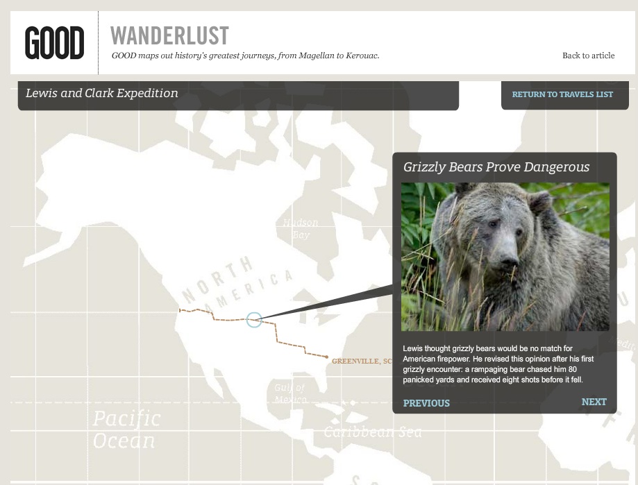
GOOD has mapped out some of history's most famous journeys, both fictional and factual, in an interactive map supplemented with information from each trip.

Here's a snapshot from Lewis and Clark's expedition:


Looks like Lewis found out the hard way that bears are serious business, though luckily he came out victorious in the end.

Read more about the map here.

Friday, July 15, 2011

World disaster map

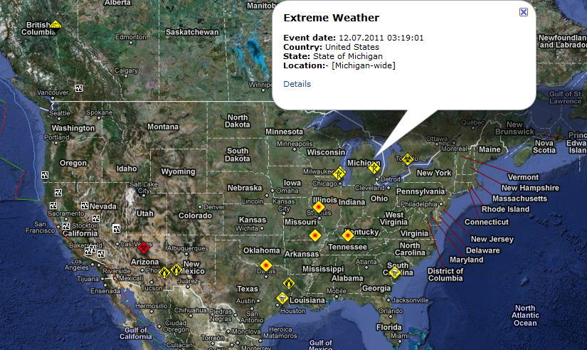
The RSOE (the Hungarian National Association of Radio Distress-Signaling and Infocommunications) has created an EDIS: an Emergency and Disaster Information Service map that displays, in near-real time, events happening around the world.

Screen captures are from July 12, 2011.
 
You can click on any event's icon to get more information about it. For instance, on this particular day, there was an icon in Michigan:


Clicking on the "Details" link at the bottom of the bubble that pops up leads you to more information about the selected disaster or emergency. This particular one was concerning the storms that had been taking place.

It's an interesting and very visual way to keep up with what's going on in the world.

Friday, July 08, 2011

The Connected States of America

Researchers at MIT Senseable City Lab, AT&T Research Labs, and IBM Research have teamed up and compiled a lot of anonymized data to create this interactive map that shows how counties interact with one another on the AT&T network. You can click on your county, or enter its name into the box at the left side of the screen, and see which counties across the nation are communicating the most.


Here is the call-time map for Washtenaw county. Other counties in Michigan and some surrounding areas get talked to quite a bit, as well as a few chunks of the East coast, West coast, and Florida.

You can also switch the map to show SMS data instead of call time, which gives you a slightly different picture:

Though the data is slightly different, the hot spots remain unchanged, for the most part.

You can read more about this research here.

Monday, June 20, 2011

Where are people moving?

Forbes.com has created this interactive map using IRS data to show where people were moving in 2008. You can click on a county to see its data-- where people moved from (with black lines) and where former residents moved to (red lines). For Washtenaw county, the results looked like this:


How about your county?

Monday, May 02, 2011

Japan's Quakes Animated

While we have heard about the Big Quakes that have been Racking japan since March 11th, it woudl be impossible to report on all the aftershocks they have been experiencing.


To allow the public to see in greater detail the quakes that have been hitting, a site called Japan Quake Map has superimposed all the quakes onto a google map and has enabled them to be animated to show time. This gives a much greater idea what Japan has experienced the days after, as well as the weeks.

Tuesday, April 26, 2011

New, New York City vs. Old new York City

This allows us to see what parts were once lush vegetation, swamps, and creeks. To read more on this and to play with the map overlays, you can check it out here.Thanks to the National Geographic we can overlay onto the current map of New York City a 1782 map.

Monday, March 28, 2011

Were do all the rental bikes pedal?


A London cycle hire company has collected data from the first million trips that these bicycles have taken. They have mapped out based on date ranges where these bikes have gone, what time of day they were used, and which paths were used more often.

You can even filter based on a bike ID and see data based on a single bike. To find out more information on this, and play with the data, you can find the link here.

Friday, March 18, 2011

Ever try to dig a hole to China while at the beach?


Luis Cipriani has created a site that helps you dig a figurative hole directly across the globe from any point with out all the dirt and work!


From Ann arbor we would end up in Indian Ocean. Where would you end up from your home? Try it here!

Monday, February 21, 2011

Ever wonder what the percentage of Adults with college degrees was in your little county?

Instead of having to fob through pages and pages of data The Chronicle has supplied its readers with a lovely interactive map consisting of data from the U.S Census Bureau from the 1940's through 2009.


A capture of Washtenaw county shows we have the highest amount of bachelor degrees for our population out of all the counties in Michigan.